
|
|

|
Art 1, First Blog
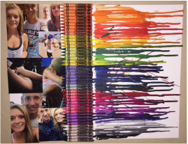
Hello, my name is Reese.
Things I like to do are play sports which include volleyball and basketball, hang out with friends and watch Netflix! My favorite show has got to be 'Friends'. The characters are just the best on that show.
I also have a cat named Charlie, she can be quite mean at times. I hope to own more cats in the future. :)
What I hope to get out of this class is to be more patient and more creative in the mind. I love drawing, it takes my mind off stressful things. I need a more open mind for drawing and being creative.
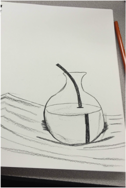
Independent Project
For my independent project, I plan to use charcoal pencils to create a picture of a flower. I hope to make the flower 3D and shade as much I can to make it as real life as possible. This is my first big project in Art 1 class so I know that it won't be perfect. I will put forth 100% in that flower I will soon attempt to draw. I'm excited to get started! :)

Second Independent Post
For my second post for my independent project is my working progress of my flower. It was a lot harder than I expected. I haven't really looked at something so different than I do now. I have some flowers that were from my birthday that are exactly like the picture in my first post on this project (the picture on the right) except the color. I use them and the picture to look at while I draw with the charcoal pencils. I've noticed that the head of the flower will be the toughest part to shade and get that 3D look. I'm liking the challenge though, it makes me feel accomplished. I'm excited to see the final product and how it turns out compared to my actual flowers at home.
|

|
|

|
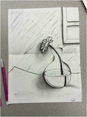
Final Independent Post

My final result of my flower is actually amazing in my eyes. I did a lot better than I thought I would! I'm very surprised and proud of my artwork. Shading was a very messy point in my project. I used tissues and my fingers to even out the shading. I practiced the flower head before I put it on my real project paper. It helped a lot to contour draw the outlining of the flower.
I added detail to show that the vase of the flower is sitting on a table with a window in the background bringing light in. The left image is taken with flash on and the right image is flash off. |
|
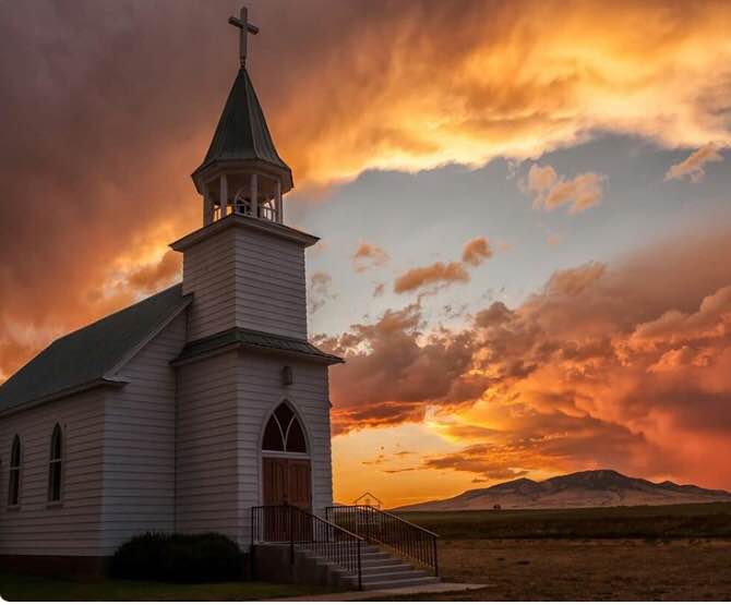
First Blog For 2nd Independent Project!
For my second independent project I will be drawing landscape. In these pictures, there's a church in a late summer's sunset background. I will be using charcoal pencil like my first project except I will be adding color to this. The picture on the left is a drawing from Pinterest, someone else's work. The picture on the right is a picture that my friend took on a gravel road going towards Columbus (town 10 miles away from Lignite). I ask him for permission if I could use his photograph and he agreed. I'm excited to get into this project! Test my artistic skills.
https://www.pinterest.com/pin/91831279873069417/
https://www.pinterest.com/pin/91831279873069417/
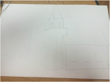
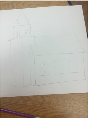
Second Post for #2 Independent Project
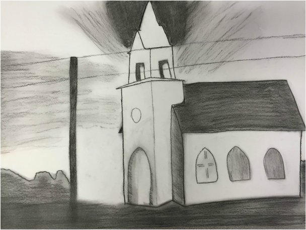
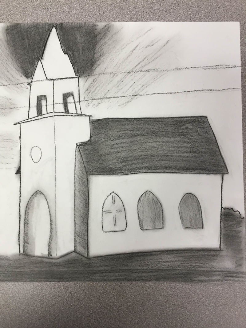
Final Post for #2 Independent Project!Here is my turn out! I would say it turned out better than I thought it would. I used shading to make the church pop a little more. I knew during the process that it wasn't going to turn out exactly like the taken photo but I'm happy with the outcome. I'm excited to work on it more and add color! I'll be sure to add another picture of the colored one.
Halloween Project!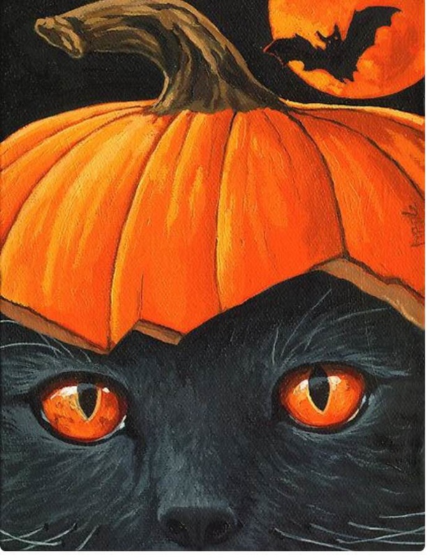

The top picture is what I based my drawing off of. It's was more complicated than I thought. It looks more like a wolf than a cat. I also had fun with putting the whiskers on. It was a fun activity to do throughout the week.
|

|
Color Mixing Challenge
Here are some pictures of the items Brook and I decided to blend colors on.
1. I learned that it was more difficult that I thought it was going to be. It was hard getting those light shading to match, for example, Brook's water bottle but we were up for the challenge!
2. What I learned it that it takes time trying to find the right colors to blend to make it match another color. All colors make certain other colors and I never knew that. I thought if you blended them, they would just turn grey. I don't know why.
3. What I would do different next time is make sure art class is in a more colorful room. It was difficult trying to find different colors.
I'm happy with our result.
It was a fun challenge. Seeing the end result made me realize there's too much white in the background. Mrs. Hein gave Brook and I some advice on trying to get rid of the whiteness. Somethings were harder to get the color spot on. For example, the types of browns used in this project. Trying not to make them look the same even though they're obviously different shades. I think darker colors are harder to blend.
There are two pictures of the blending art work we had worked on. The one next to the water bottle and scissors is the first attempt to the blending. The bottom one is our other attempt trying to get the white out of the background. I can tell the difference in the two. We had to put more pressure onto the paper to get that white out of there and it increased the colors very well.


6 Illusion artwork


Here is my drawing of the 6 illusions! I had a lot of fun putting this piece together during class. The road is linear perspective because it goes back into the hills (it looks like its going into the sky but it's really not supposed to.) The trees and clouds are overlapping each other. The kites that the stick people are holding have detail along with the stop signs on the road. Value and color are the hills. The close one is darker and the lighter one is farther away. Size would be the kites also because ones bigger than the other because of where the stick people are placed. The last thing is placement which is the stick people in my drawing. The bigger one is on the greener hill which means it's closer and the smaller stick person is father away on the lighter hill.
Personal Landscape: Mchenry County
IDEA:
For my personal landscape project, I will be drawing Mchenry County. I'm from Velva and Velva is in Mchenry County. I grew up in Velva and I moved to Lignite when I was going into the 8th grade. My dad lives there with his future wife and two kids. All together I have 4 siblings. Morgan would be the oldest out of them. She's 13 while Logan is 8, Jace is 4 and Abigail is 2 weeks today.
CHALLENGES & SUCCESSES:
It's been a challenge to think of things that put me in a happy mood while I'm there because there's not much there to begin with, but it's a fun challenge. It makes me think deep. I'm excited to see how far my mind can go.
Here's a picture of what I've done so far.
WHAT'S LEFT:
I plan to finish this project by adding some more big and small details to the artwork and adding color here and there.


Final Post for My Personal Landscape
LEARNED:
What I learned from this project is that it's pretty hard to think outside of the box. I've had difficulties trying to find things to fill in the white space, but I soon got it. It all came to me at once. I was brainstorming for the longest time.
FUTURE:
All this brainstorming and thinking made me realize that good things come to people who wait. My head just exploded with ideas when I've been thinking of what I want to do for this project. It took a couple days just to figure out what location I wanted to use.
Remembering that good ideas come to those who wait will absolutely help me out in the future.
The two pictures look the same because they basically are but one is with flash and the other isn't.


Painting Boot Camp
1. What I've learned about the last three challenges was that I like painting more than anything. It's easy for me to dip a brush into some thick paint and sliding it smoothly across a piece of paper rather than putting pencil to paper.
2. What I've learned that is the most important would be that a little goes a long way so I don't need a lot on my brush.
3. The knowledge I gained will help me focus more on big projects. I love painting. I've learned that it relieves my stress because I get so focused on the artwork I create. I feel like that will help me in future assignments and stressful situations.
These pictures below are what I created. It's my cellphone on a desk while being charged. I used saran wrap to make the texture pop out to make it look like it's actually laying on something.


Winter Break Mini Project
1. My artwork is about the time I went snowboarding over break. It was so much fun! I went with my dads side of the family and my boyfriend. It was my first time ever and I'm actually surprised on how well it went! All I want to do now is snowboard!
2. I decided on doing this because it was the most fun I had all break.
3. I created this by visualizing what a person would look like when they would hit a jump. The wind blowing in his or her face, having a lot of fun. I sketched out the board and drew a girl around it then added detail. I used color pencil to color it.

Color Scheme Project
1. For this fantastic project, I will be using the Monochromatic color scheme. I chose this color scheme because I would like to see where my skills are in shading and/or tinting is. I feel like I'm getting pretty good at adding a little black or white to a plain color. I love messing with paint as well, it relieves stress.
2. The challenges I'm finding is getting the lines to be in the write spot. There are a lot of lines on a zebra obviously, but I started painting it and I have to look for a couple seconds before I put my brush on the paper to make sure the paint is going in the right place or not.
3. I plan to finish my piece by painting it using tints and shades and then erase all extra lines. I'm pretty satisfied with what I've accomplished so far. I'm excited to show this piece off!


Final post for color scheme project.
1. What I've learned from limiting my choices to a specific color scheme is that it's harder than it looks to blend one color. I had to be careful not to add too much white or too much black. One can tell where I added black for sure. I also didn't want to ruin this artwork of mine, I worked very hard on it.
2. I'm sure I'll use color schemes in the future because everything around the world is colored, even the lightest tint or shade. It's still colored.
3. Overall, I learned that if you take your time and put a lot of effort into your art piece, it'll turn out better than you expected. Taking time to figure out if I should put a tint somewhere or a shade somewhere else took quite some time too. Overall, monochromatic color scheme might be my favorite!


Final Post. 2/12/16
|
1. What I've learned when I watched the videos Steal like an artist and Embrace the Remix is that I know understand art in a different way. It makes sense now. Good artists copy ideas from other artists or things that are already created and make a new art piece, but with their own ideas. Great artists steal ideas from others without even asking the original artist if it's okay.
2. What I've learned about the three techniques is that they all deal with copying or stealing from another artist. There's no original ideas that form. Out of the three words, parody, intertextuality, and appropriation, I would have to say that I've used appropriation. I made my own eye and added what I wanted in the pupil, but many people have done this before. I didn't copying the whole thing, I made my own touches to it. 3. The process was hard to start. There were so many things out there to choose from! I decided to do an eye piece. I also decided to draw what I'm feeling, like most artists do. There's a back story, but I'll just keep it simple. In the middle of the pupil, you'll see a weird white blob. If you look closely, you can see two side views of a girl and a boy. Their noses are touching which means they're pretty close. I drew this in the pupil because it's what the 'girl' or the 'eye' is seeing. It's seeing two people love each other, but this is where the tear drops come in. The tear drops are located in the corner of the eye and slightly right of the pupil on the bottom. This symbolizes betrayed. That boy in the eye of the girl is supposed to love her, not the other girl hence the title of the piece. "Cheaters Never Win..." The boy will lose the girls' trust and it's already starting to break her heart. 4. This unit has change my thoughts of inspiration by knowing that nothing is original, everything is either copied or stolen from another persons thoughts and ideas. We just add our own ideas to our copied or stolen art pieces. Final Perspective ProjectThe two best perspective drawings are my hallway final drawing and my city block drawing.
My experience with perspective drawing is going well so far! I'm enjoying it a lot. It makes sense to me! I can actually draw a building or a hallway now and it actually looks like it. When we started this project, I was kind of second guessing if using a vanishing point really helps. But I learned that it helps and forms the project fully! I enjoyed making these projects and seeing how well the lines gradually formed into a picture. What I didn't enjoy was the left over lines and erase marks I had. No matter what I did, they wouldn't go away for some reason! Knowing these techniques will help me in the future by helping me reduce my stress level. Going into college next year, it's already getting stressful so using the techniques I have learned and getting out a sheet of paper and putting the pencil to it, it'll help a lot. I'm sure I'll use this technique in future projects such as POD. |
|


Final Limitation Post
To start off this project, I was a bit confused. We were on the start of our spring break so I had to work through the videos independently. The videos we had to watch really brought me to attention. They interested me. What I've learned from watching those films is that using limitations inspires us. It makes us think outside of the box. Besides putting pen or pencil to paper, we would have to think of different ways to create art. Like for example. Phil Hansen got told by his doctor that he should embrace his shaky hands and make messy art. Phil thought his artistic days were over, but then the doctor lifted up his spirit and he didn't care about his shakiness.
To complete my challenge, I had to use makeup. I decided on this limitation because makeup is a strong source of mine. Once I started, I noticed that makeup doesn't stick well on a canvas. I had to put layers and layers on to make it show up just a little bit. I started off by using blue painters tape to tape some weird zig-zag line so I can draw half of a face down the middle. Once I accomplished that, it was easy filling in the edges. I let that sit for a couple days for it to dry. Once I realized that it was dry, I started to trace the outline of the face onto the canvas with eyeliner. I traced very lightly so I could erase something if I needed to. The face shape is kind of awkward, to me anyways. After that, I drew in the eye, nose, and mouth. I used foundation to color the hair and make it look like it has texture. Next, I used eyeshadow and liquid eyeliner to get the key figures of the eye. I filled in the eyebrow with an eyebrow pen. Then I used lip gloss to fill in the lips. I used the liquid eyeliner to outline the lips as well. I put blush on the face as well to make it look more realistic.
What I've learned by doing this limitation project is to think outside the box, as I said before. It really brought me to attention that artwork isn't just pen, pencil, or paint. It's so much more than that and so many people don't realize that until they face their limitations like we had to in this project. It needs some creativity that's for sure.


Paper Mache Mask
For our next assignment, we had a couple options on what we wanted to do. I picked paper mache. I used Elmers glue and water to get started. I mixed them to get a thick liquid. I then shredded up lot of old newpapers and form them into short strips. I eventually got done with that and started to dip the paper into the glue and water. We have masks in our classroom so I used that instead of my own face or someone else's. I let it dry a day then came back and put another layer on it. I let that dry over the weekend. I came back and decided that I wanted to decorate it as an emoji. I'm still working on it. Right now, I only have one layer of yellow on. I'm waiting for it to dry to add another then eventually adding more colors to make the emoji.


Document Learning: Final Blog Post
1) Pretest Self Portrait: My facial project was rough the first time I sketched it out. I obviously made some changes. Looking back and forth from a 'selfie' I took was difficult. It's hard trying to match what you look like when you don't know what you're doing, haha. One thing I knew before we did the proportion guide is that the hair line goes up, not straight. I figured that out on my own, I noticed that it looks more natural if it goes out of the top of the head like you're hair is staticky.
2) Facial proportion guide: This project was probably the hardest one. What I've learned throughout the facial proportion guide project is that it's difficult trying to get both sides of the face to match. Good thing we drew in the lines on where the ears, eyes, nose, and eyebrows were supposed to go. Those lines helped me understand where to put them and how big to make them. I had the toughest time trying to get the outside of the head where it's supposed to go because the eyes on a face are supposed to be in the middle. It took some time to figure out where the center was to put the head.
3) The facial feature challenge assignment was challenging, haha. I wish we had more time to modify the parts we had to sketch. It was hard finding hair to draw because the pictures were all so small. Now that I've drawn lips, ears, and noses, people have very different features on them. Not saying I didn't notice that before, but I didn't think they were all so VERY different. Although this took quite some time, they didn't turn out how I planned. I always have this vision in my head on what they're supposed to look like and they never turn out the way I want them to.
Overall, I improved in the facial department. I think my eyes on the pretest are better than the ones on my proportion guide. I wish I traced lighter so the lines aren't so noticeable now. I improved by having a realistic facial outline and the nose actually looks pretty good. I went back and watched a few more videos on facial proportions and they helped my a lot by teaching me it takes time and you have to redo and redo to get it perfect.
